
Fun | Operating Systems | Jerash | Islam | Then...and Now | Art | Posts in Arabic : عربي or in Italian : Italiano
This blog is TOTALLY designed by me.
|
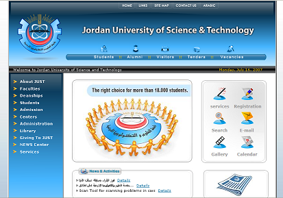
The guys of the Computer Center have made a good job, after the more-than-six-months beta test, the new website of JUST has been officially launched : A cutting edge look, better performance and more functionality!
Based on ASP.NET technology, with a relevant utilization of AJAX features, the new site offers some newer technologies and, for sure, a more innovative design compared with the previous site, however there are a few things I think the Computer Center should work on: 1- The Arabic website, and most of the sections in Arabic are under construction.
2- Some pages on English website are in Arabic, I don't know why. 3- The documents are in .doc format rather than .pdf (I know that Micro$oft rules there, but PDF is a standard) 4- Some broken links (Ouch!). 5- New features must be added to the library page (e.g a student can see when a book's loan period ends) 6- Please make a really interactive map or something similar to a GIS, all maps on the current site are unhelpful. 7- CHANGE THE REGISTRATION SITE NOW!!. I promise that I'll carry these points to the Computer Center (I'm in good relations with them), and if anyone has a suggestion leave a comment :)  Labels: JUST, Technology
|
||||||||||||||||||||||||||||||||||||||||
 TECHNOLOGY
 JORDAN
 WHAT'S ON THE WEB?
 POLITICS
 MOVIES

 If you are a JUST student and you enter
They finally did something decent!!! I hope they got rid of the habit of developing mis-functional, vulnerable, easy-to-penetrate, miserable looking, registration systems.
Posted by Abed. Hamdan |
Jul 17, 2007, 11:33:00 PM
Abed. Hamdan |
Jul 17, 2007, 11:33:00 PM
I hope that abed! The good thing is that Web Design dept in the center has recent graduates with new ideas.. but the other departments do not have the same creativity or sense of innovation :(
Posted by Issa |
Jul 18, 2007, 4:54:00 PM
Issa |
Jul 18, 2007, 4:54:00 PM
Issa, this is not related to this post. But I was quite impressed with the look of your blog. keep up the good work.
Posted by Unknown |
Jul 19, 2007, 12:20:00 AM
Unknown |
Jul 19, 2007, 12:20:00 AM
Thanks Shifaa, by the way I'm a regular reader of your blog.
Posted by Issa |
Jul 19, 2007, 12:48:00 PM
Issa |
Jul 19, 2007, 12:48:00 PM
I worked there for 4 months, and I'm very disappointment.
Practically every employee there is employed by wasta!! Their work is anything but professional and they are a big source of money waste.
Posted by Abed. Hamdan |
Jul 22, 2007, 5:07:00 AM
Abed. Hamdan |
Jul 22, 2007, 5:07:00 AM
You're right! Do you know for example that the guy who was designing our old sites do not know anything about HTML, he told me that he is "specialized" "only" in ORACLE !?!
Well, if you worked there you know who I'm talking about ;)
Posted by Issa |
Jul 23, 2007, 9:17:00 PM
Issa |
Jul 23, 2007, 9:17:00 PM
Post a Comment
<<Home